Posts

No time to cook

Image
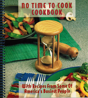
What fitting a way to end the semester. My mom and I were at the YMCA and we went inside the shop. My mom found a cookbook on the salve. She decided to pick the cookbook and buy it. The name of the book is called “no time to cook cookbook” When I looked at the cover I got the impression that was supposed to make fun of people who don’t have enough time. The center of attention is the hourglass which emphasis time. The food and pan and plate and fork placed randomly. That indicates fun and playful.  The spacing for the typography is open spaced and the words are under caps.  The words have a transparent box. They did that so you could appreciate the food. The name of the font is Helvetica sanserif and the style is regular. I like this cover because it’s fun and playful. YMCA
Remember Remember the 5th of November

Image
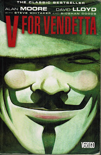
I found this cover design at Champaign Library. The name of this book is called V for Vendetta. The author for this book is Allan Moore. I Remember reading this book and I loved it. For the layout they use illustration of the Guy Fawkes mask. They center that on the front page. The words in V for Vendetta are red to make it stand out and danger is ahead. The colors that’s being used is low saturation. The spacing for kerning is tight to give it some tension. The proportions are evenly spaced and balanced. The typeface that’s being used is Helvetica sans-serif and condensed. I like this cover because for it’s serious look.     Champaign Library

give me a ride

Image
I found this record design at record swap that’s located in 114 E University Ave, Champaign, IL 61820. The name of the record is called Jack Johnson by Miles Davis. I walked towards the shelf and grabbed it. I gave it a quick glance and brought it back to the self. Then I walked out of the store.   The layout shows unity by placing the car towards the center of the page. I believe this came from the 1960's. The colors are both bright and dull which they wanted to emphasizes the car and the people inside of it. The imagery in the back is the least important in the picture. The spacing for the typography is evenly spaced. The kerning is a little tight. The typeface is times new roman serif and the style is regular. What attracted me about this is was the transitional look to it. Parkland college GDS 172

the serious night

Image
I found this publication at the Champaign Public Library.   I was looking around for a book to read and I found this book. The name of book is called Machete Season by Jean Hatzfeld.     The cover layout shows unity by using an image of a guy walking around a trail path in a foggy day. Title is placed towards the top of the page and words “The Killer in Rwanda Speak” is on the right side of the page. The name of author is placed towards the bottom. The colors on the photo that is being use low saturation.   The Typography is evenly spaced and Proportional.     The designer used Helvetica san serif regular and the style would be condensed and regular. What I like about this cover is the serious look to it. Champaign Public Library

Make me a story.

Image
Technically, I found this publication one day at the Champaign Public Library.   I loved it so much that I decided to buy a copy for myself.   The title for this book is called the making of a story by Alice Laplante.   The cover layout shows unity by centering the words and placing them around a blue border. The hierarchy of words shows the title toward the top and the author towards bottom of the page. The words “the” and” of a” are different from the title. The wanted the book to have a classical look to it. A Norton guide to Creative Writing has a double border and a black background. They did this because they wanted people to know the purpose of the book. The typography is evenly spaced and well in proportion. The first typeface is Baskerville Serif and the styles are bold, regular and italic.   The second one is a script. What I always loved this book is the modern and traditional look. Champaign Public Library

Bring on the tension.

Image
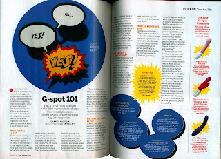
I found this informational article at Parkland College library. The name the article is called G-spot 101 by Amanda MacMillan. The layout is separated into 11 paragraphs. Each paragraph talks about separate questions for sexual intercourse for women. The illustration towards the top of the page is animated and eye-eye-catching. The words Yes gets bigger towards the end to give it action. In my head, I can image the boyfriend pleasuring his girlfriend, until she gets an orgasm. Hence, the title name G-Spot. On the right side you can see four dildos being displayed. They wanted to emphasis the best ones by using action words. The Typography is proportion and spaced evenly on the page. Helvetica Sans-serif, and the style is regular. What attracted me about this piece was the tension and playful look. Health magazine march 2018, Parkland College Library

Detective Chick

Image
I found this publication at Parkland College library. The name of this book is called Legal Tender by Lisa Scottoline. The layout for the cover shows the author placed towards the top and the title towards the bottom. The designer emphasis the words “Legal Tender” to make it look mysterious. The author for the book is colored white. The white spacing is passive because it’s centered on the cover. The image shows a woman walking towards the sidewalk. Part of her face and feet are cut off the page. Her lips, upper legs and chest are being shown. She wears a red jacket, black shirt and pants, which remains me of Carmen Sandigo.  The spacing and proportion are evenly spaced. The name of the author is white, and the title of the book is purple. The type that’s being used is Helvetica sans-serif and the style is all caps. I can also see Times New Roman serif and the styles are italic and regular. What attracted me about this piece is the feminine, trendy and serious look. ...

shoot to the next level

Image
In the writer’s magazine, an informational article made by Mike Dunphy. The page layout has six separated paragraphs and each number is pixeled. Around the quote shows a picture of a platform. To make it look as if it was standing on it. The block of text is a justified to the right side. All the paragraphs are facing the left of the page. Its unified by using pixeled art for illustrations. A strawberry is shown to be the yellow line break. The author wanted to give the strawberry movement.   The design that’s being used is contemporary art. The typography is evenly spaced for spacing and proportion. The kerning is well in proportion and evenly spaced. The heading for the cover has one color: white.   The numbers and paragraphs are black.   The typeface is custom made by the author himself. So, I can’t identify the font. But I do know he uses lower case letters for the words. What attract me the most about this piece was the cover for Its in...

The trees are high in the skies

Image
In the IEEE Spectrum magazine, an informational article made by Mark Harris. The page layout shows unity by using imagery and block of text with a heading on the top of page. The heading has a boarder around the words that says: “the Internet of trees.” The details include a transparent white box with antennas around it.   The heading has been indented toward the left side of the page. The title emphases that the trees are working for the internet.   In the picture, the trees are centered around the antenna. The paragraph is one page long and it’s justified to the left and right side. The block of text, the white spacing is evenly spaced on the page. The Typography is evenly spaced for spacing and proportion. The kerning is well in proportion and evenly spaced. The heading has two colors: brown and black. The words internet and trees are brown. The words the and of are black. The typeface is times new roman serif and the style is regular. What attract me the...

coding

Image
In the Ad Buster magazine, there is an informational article made by Ryan Trimble. The picture on the right side shows unity by placing code intuitively on the page.   The paragraphs are flushed to the right side.   The paragraphs are separated into five equal columns. The white space is evenly centered and balanced. The picture is covered with code to emphasis the point that there is an error.   The composition of the black and white page makes it like a computer screen. The kerning for the Helvetica san-serif is tight. The font style is standard, and the color is black. Proportions are evenly spaced. I liked this piece for its intuitive and innovative approach. Ad Buster. March 2018

Shout out the answer!

Image
In the writers magazine, Jack Smith created this informational article. The page layout has a structure that’s symmetrical. The Illustration is bigger than the article.   He wanted to emphasis the point that the mouth is shouting out the words. It creates a nice balance between using illustration and typography. The design style is complimentary. The spacing and kerning for the typography is even. The proportions are aligned and spaced evenly.   The white and black colors with the red background works well. The typeface is Helvetica Sans-serif and style will be condensed.   What attracted me about this piece was the animated and narrative approach.      

raging feminist

Image
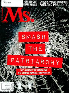
This informational article is for Mrs. Magazine. It’s a magazine for the feminist.  The layout is separated into three paragraphs. Each paragraph is evenly balanced and aligned to the right side. The white spacing is good because the distance is not to close together with the image. The structure for the block of text is squared around the image. The proportions of the typography is balanced and even. The kerning isn’t too close or too far apart. The colors are red and black. The spacing is even and balanced. The title is a script italic. The headline is standard sans-serif Helvetica. The body of text and quotes are Serif times. What attracted the most was headline of the article. I got the impression that Kamaladevl Chattopadhyay (the person you see on second page) wanted to influence other people to come join her quest. To bring back the power in womanhood. The title almost felt audible to me Mrs. Magazine winter 2018

Discover the world

Image
It’s function is a informational article from  Discovery magazine. The structure for This two-page layout is aligned to the right side of the page. The letter “M” has a drop cap that blocks over the strain of text. The white spacing is evenly spaced. One-line of text has been separated into two columns. The font that’s being used is times new roman. The kerning is evenly spaced which centers the words on the cover of the page. The article and cover are aligned mathematically and scientifically. Type classification is a standard serif. What attract me the most about this magazine was the typography. The green letters makes it look traditional and national.   Discover magazine