No time to cook
What fitting a way to end the semester. My mom and I were at
the YMCA and we went inside the shop. My mom found a cookbook on the salve. She
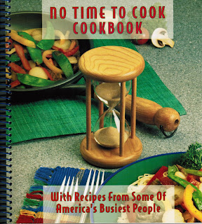
decided to pick the cookbook and buy it. The name of the book is called “no time
to cook cookbook” When I looked at the cover I got the impression that was supposed
to make fun of people who don’t have enough time. The center of attention is
the hourglass which emphasis time. The food and pan and plate and fork placed randomly.
That indicates fun and playful. The spacing
for the typography is open spaced and the words are under caps. The words have a transparent box. They did that
so you could appreciate the food. The name of the font is Helvetica sanserif and
the style is regular.
I like this cover because it’s fun and playful.
YMCA


Comments
Post a Comment