Posts

Showing posts from February, 2018

The trees are high in the skies

Image
In the IEEE Spectrum magazine, an informational article made by Mark Harris. The page layout shows unity by using imagery and block of text with a heading on the top of page. The heading has a boarder around the words that says: “the Internet of trees.” The details include a transparent white box with antennas around it.   The heading has been indented toward the left side of the page. The title emphases that the trees are working for the internet.   In the picture, the trees are centered around the antenna. The paragraph is one page long and it’s justified to the left and right side. The block of text, the white spacing is evenly spaced on the page. The Typography is evenly spaced for spacing and proportion. The kerning is well in proportion and evenly spaced. The heading has two colors: brown and black. The words internet and trees are brown. The words the and of are black. The typeface is times new roman serif and the style is regular. What attract me the most abo

coding

Image
In the Ad Buster magazine, there is an informational article made by Ryan Trimble. The picture on the right side shows unity by placing code intuitively on the page.   The paragraphs are flushed to the right side.   The paragraphs are separated into five equal columns. The white space is evenly centered and balanced. The picture is covered with code to emphasis the point that there is an error.   The composition of the black and white page makes it like a computer screen. The kerning for the Helvetica san-serif is tight. The font style is standard, and the color is black. Proportions are evenly spaced. I liked this piece for its intuitive and innovative approach. Ad Buster. March 2018

Shout out the answer!

Image
In the writers magazine, Jack Smith created this informational article. The page layout has a structure that’s symmetrical. The Illustration is bigger than the article.   He wanted to emphasis the point that the mouth is shouting out the words. It creates a nice balance between using illustration and typography. The design style is complimentary. The spacing and kerning for the typography is even. The proportions are aligned and spaced evenly.   The white and black colors with the red background works well. The typeface is Helvetica Sans-serif and style will be condensed.   What attracted me about this piece was the animated and narrative approach.      

raging feminist

Image
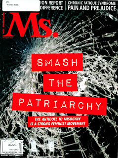
This informational article is for Mrs. Magazine. It’s a magazine for the feminist.  The layout is separated into three paragraphs. Each paragraph is evenly balanced and aligned to the right side. The white spacing is good because the distance is not to close together with the image. The structure for the block of text is squared around the image. The proportions of the typography is balanced and even. The kerning isn’t too close or too far apart. The colors are red and black. The spacing is even and balanced. The title is a script italic. The headline is standard sans-serif Helvetica. The body of text and quotes are Serif times. What attracted the most was headline of the article. I got the impression that Kamaladevl Chattopadhyay (the person you see on second page) wanted to influence other people to come join her quest. To bring back the power in womanhood. The title almost felt audible to me Mrs. Magazine winter 2018