Shout out the answer!
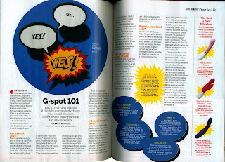
In the writers magazine, Jack Smith created this informational
article. The page layout has a structure that’s symmetrical. The Illustration is
bigger than the article. He wanted to emphasis
the point that the mouth is shouting out the words. It creates a nice balance between
using illustration and typography. The design style is complimentary. The spacing
and kerning for the typography is even. The proportions are aligned and spaced evenly.
The white and black colors with the red
background works well. The typeface is Helvetica Sans-serif and style will be condensed.
What attracted me about this piece was the
animated and narrative approach.


Comments
Post a Comment