raging feminist
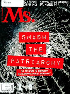
This informational article is for Mrs. Magazine. It’s a magazine
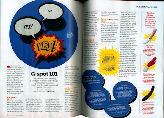
for the feminist. The layout is separated
into three paragraphs. Each paragraph is evenly balanced and aligned to the
right side. The white spacing is good because the distance is not to close together with the image. The structure for the block of text is squared around the image.
The proportions of the typography is balanced and even. The kerning isn’t too close or too far apart. The colors are red and black. The spacing is even
and balanced. The title is a script italic. The headline is standard sans-serif Helvetica.
The body of text and quotes are Serif times. What attracted the most was headline of the article. I got the impression that Kamaladevl Chattopadhyay (the person you see on second page) wanted to influence other people to come join her quest. To bring back the power in womanhood. The title almost felt audible to me
Mrs. Magazine winter 2018


Comments
Post a Comment