Discover the world
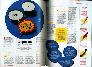
It’s function is a informational article from Discovery
magazine. The structure for This two-page layout is aligned to the right side of the page. The letter “M” has a drop cap that blocks over the strain of text.
The white spacing is evenly spaced. One-line of text has been separated into
two columns. The font that’s being used is times new roman. The kerning is evenly
spaced which centers the words on the cover of the page. The article and cover are aligned mathematically and scientifically. Type classification is a
standard serif. What attract me the most about this magazine was the typography.
The green letters makes it look traditional and national.
Discover magazine


Comments
Post a Comment